Travel and Transient: Text Pattern Audit and Library
Cvent — July 2024-January 2025Content Designer ⸱ Strategist ⸱ Auditor
CONTENT AUDIT ⸱ TERMINOLOGY ALIGNMENT ⸱ TEXT PATTERN LIBRARY
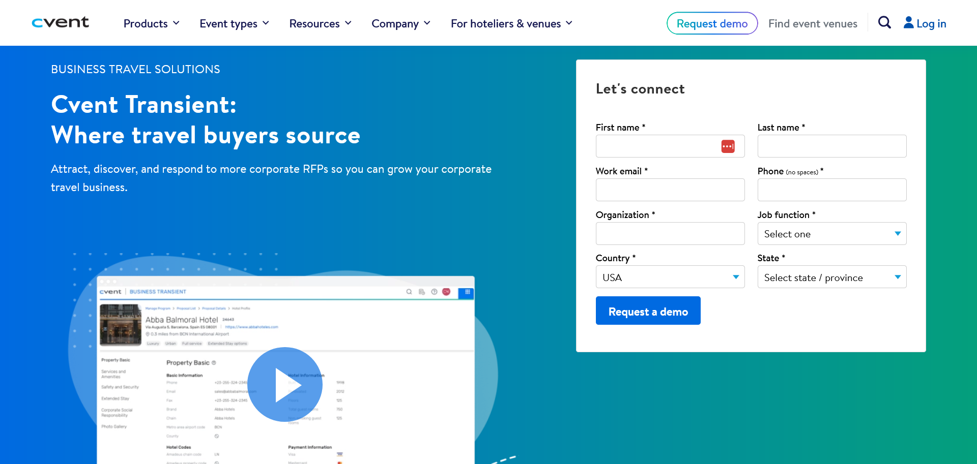
Cvent Transient is a platform for corporate program managers to source venues and create travel programs for their employees or corporate clients.
The problem
Travel and Transient is a software service that provides for two user groups:
- Program managers and corporations (demand)
- Hotels (supply)
Both user groups interact with each other via the software. The platform for both the demand and supply users are mostly the same, however, there are some nuances where the language is targeted for the respective groups.
In addition to designing for our user groups, the product itself consists of multiple stages that result in multiple design files. The designers regularly have these files open for reference but hunting the right tab in Figma had a negative impact in overal design efficiency.
To better support the team, I prioritized product areas, audited the text patterns, and created a text library to simplify content referencing. The audit checked for inconsistencies and termniology use, as well as errors that needed to be fixed. The consolidation put the content of the user groups side-by-side in a more accessible way to make the overall design process easier.

The approach
Scope the project
To make the projet manageable, I broke the project down into smaller chunks that focused on specific areas of the product, including negotiation workflow, setting up a program, searching hotels, etc.

Audit and text pattern
Once the scope was set, I audited the workflows to collect, compare, and contrast text patterns.

Final output
For each product area, I created a spreadsheet with text patterns for both user groups. This provides designers–and whoever else–an easy way to compare and contrast text patterns without worrying about visual design.

To further help the designers easily access all the patterns I created for them, I created a “resource helper” component in Figma that they can pull into their files. The helper component lists all the text pattern files so they don’t have to tab out of Figma to look for it.

Lessons learned
This was one of the more complex projects I’ve done. By default, we tend to work in Figma but this project highlighted that we don’t always have to work in Figma–in fact, Figma may actually make things more complicated. I’ve learned to be less averse to using spreadsheets or other tools that are more suited for the job at hand.
I also learned to disconnect the text from the visual designs. Very often, people want to see the whole package but this can be distracting, especially when the focus needs to be on the text itself. It took the product designers some convincing to look at the text alone but once they saw how much easier it was to compare text between the user groups, we were able to audit and create these resources a lot faster.
The files I created for this team continue to be used to this day. The designers regularly update the files themselves with updated text as needed. The resource component itself has been adapted on other teams for their use.